 AB Design
AB Design
AB Design
I've helped clients a lot with their content strategies and have authored dozens of media-rich articles, some of which rank well on Google. I also keep this blog and write about topics related to design, typography, and the history of NASA.
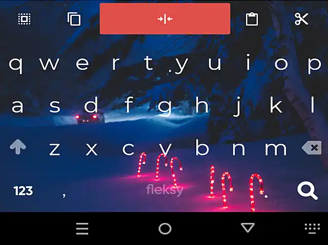
Due to privacy concerns and increasing user awareness, not everyone wants to use a Google or Microsoft keyboard. This article compares three popular Android alternatives.
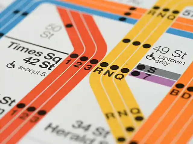
Helvetica is the go-to typeface on the New York subway, but it wasn't until 1980 that it began replacing a German rival introduced over a decade earlier.
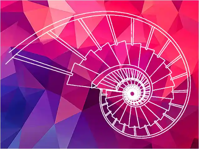
This is a brief, colorful study that sheds light on aspects of Penang's history and culture, and examines a handful of outstanding spiral staircases.
Inspired by the movie Hidden Figures, this article tells the story of little-known black women who contributed to NASA's space program during the 1960s.
This is a detailed study that addresses some of the myths surrounding the famous NASA lens that in all likelihood was never used in space.
Via is one of the fastest browsers for Android. It's also one of the most feature rich and battery efficient. So why is it so fast, and what else makes it different?
This article takes a look at French-made Angenieux lenses and the pivotal roles they played in some of NASA's most important missions.
Though used sparingly in web design, asymmetry is an interesting composition technique that embraces contrast and variation, and can at times lead to striking results.
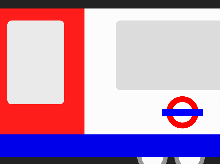
Introduced in 1916, Johnston Sans is an integral part of London's design language and one of the world's longest-surviving examples of a corporate typeface.
The Firefox text reflow extension is the most useful mobile browser add-on I'm aware of. Find out what it is and how it can improve the way you browse the internet.
Favored by cinematographers since the golden age of Hollywood, Cooke lenses are esteemed for their for their warmth and realistic skin tones.
Load More Articles