 AB Design
AB Design
AB Design
Operational since 1904, the New York City subway is North America's largest and busiest metro system. It's also one of the world's oldest and one of the few that's open 24/7.
The key to navigating this vast, criss-crossing maze is a signage system that evolved from a state of utter confusion during post-war years into the coherent, unified system we know today. Two typefaces helped pave the way for this transformation: Akzidenz Grotesk (known in America as Standard Medium) and Helvetica.
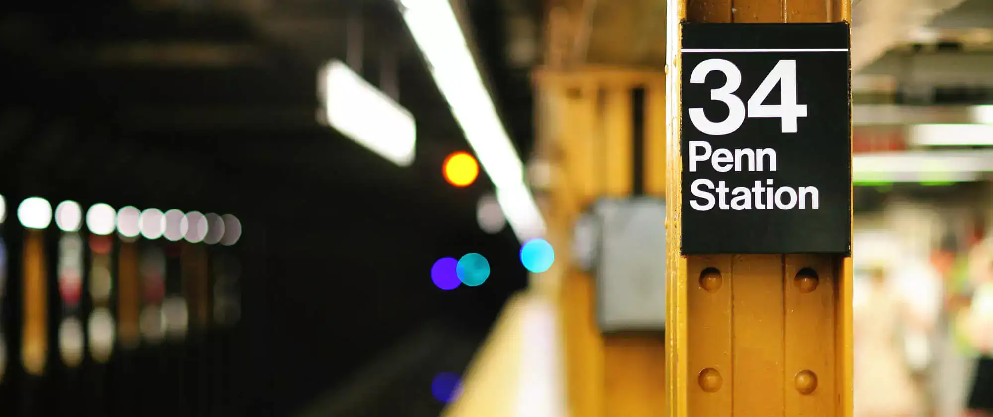
Many of the system's oldest stations have retained traces of their original signage and mosaic station names. These tile mosaics – fine examples of which can be found at 34th Penn St, Times Square, and Wall Street – typically date back to the early 20th century and for the most part represent the creative vision of Squire J. Vickers, chief architect of the subway from 1908 to 1942.
Since the mid 1980s New York's Metropolitan Transportation Authority has committed itself to preserving the subway's mosaics, some of which have been described as "museum quality". But the work is expensive and time consuming, and despite ongoing projects to renovate the metro, preserving 100-year-old mosaics is always a lower priority than upgrading antiquated signaling, addressing poor ventilation, and improving disability access.
By the 1960s, signage on the New York subway had degenerated into a chaotic mess. There was no manual of style or even basic style guidelines. Signs introduced before and after WWII were often typographical nightmares and wholly at odds with their elegant tile-mosaic counterparts.
In 1966, in a bid to restore uniformity, the New York City Transit Authority (NYCTA) hired design firm Unimark International to create a system-wide design language that would rid the subway of its confused and conflicting signage. Unimark promptly recommended that existing subway signs be scrapped and replaced with Akzidenz Grotesk (Standard Medium).

It is vital that all signs be read easily and understood quickly. This demands the consistent use of a distinctive typeface throughout the entire system. Research has shown that the most appropriate typeface for this purpose is a regular sans serif. Of the various weights of sans serif available, Standard Medium has been found to offer the easiest legibility from any angle, whether the passenger is standing, walking or riding.
Unimark International
Unimark's signage system began rolling out in 1967, but initial results were lackluster. The NYCTA's sign makers didn't understand Unimark's European designs, nor did they know how to set and implement them.
But the NYCTA remained buoyant and in 1970 – with the publication of Unimark's Graphics Standards Manual – a truly unified system was put into place. It was a great success and still forms the backbone of the signage system used today.
After beginning life in 1957 at the Haas Type Foundry in Switzerland, Helvetica rose to fame and near-global ubiquity in less than a decade. Its clean, simple aesthetics captured the spirit of all things modern and helped usher in a forward-thinking era that eschewed muddled design ideas of the recent past.
All of which raises an obvious question: if Helvetica was the go-to typeface in the mid to late '60s, why didn't Unimark choose it for the New York subway? It's an interesting question, and one that's spawned in-depth research and even a critically-acclaimed book. The simple answer seems to be that NYCTA's sign makers didn't have Helvetica at hand and the cost of shipping its metal plates from Europe was more than budget would allow.
Before examining why Helvetica began entering the subway system in 1980 (and eventually replaced Akzidenz / Standard in 1989), let's compare these two typefaces and see how they differ.


In 1980 a new edition of the Graphics Standards Manual was issued. Revisions were mostly minor, but one change was notable. When the letter J was used on circle and diamond signs representing the J train, it was to be set in Helvetica rather than Akzidenz Grotesk. This was Helvetica's first appearance on the New York subway system.
The reason for this switch is shown below. Helvetica's J has a more scooped appearance than its German rival, making it more legible when viewed from afar or when looking at it from a moving train.

The gradual shift to Helvetica continued throughout the '80s, and in 1989 it was declared the subway's official typeface. Some of the older Akzidenz / Standard signs remained in place (and a few of them are still in place even today), but from 1989 onwards all new signs were Helvetica.
Several reasons underpinned this shift, not least of which is Akzidenz no longer enjoyed the cachet it had back in the 1960s. Another reason is technological: Helvetica was simply more suited to the new digital age and the printing opportunities it afforded.
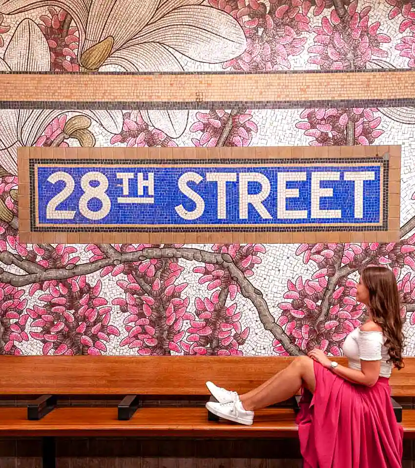
If you're thinking that an analysis of the New York Subway system's signage and vintage artwork might seem a tad obscure or of little interest, think again. The tile mosaic below, featuring a sans serif set in sturdy Roman capitals, is considered by some to be one of the most Instagrammable spots in New York.
Introduced in 1916, Johnston Sans is an integral part of London's design language and one of the world's longest-surviving examples of a corporate typeface.

Though used sparingly in web design, asymmetry is an interesting composition technique that embraces contrast and variation, and can at times lead to striking results.