 AB Design
AB Design
AB Design
Asymmetric web design is a difficult but rewarding approach to design where conventional symmetry is eschewed in favor of dynamic, uneven layouts that are frequently interesting and at times quite remarkable
This article dives into the world of asymmetry, shedding light on some of the underlying design principles and concluding with practical ideas and a summary of best practices.
Most modern website designs are based on generic, off-the-shelf templates featuring conventional symmetry. Exceptions occur with news sites such as the BBC, where above-the-fold asymmetry is used to emphasize fresh or featured content. But even with the BBC, designs typically switch to a symmetric format as users scroll down the page.
While symmetric templates have several advantages (they're usually quick and easy to set up, for example), asymmetric layouts offer greater potential for a "look and feel" that's unique, immersive, and finely tuned to meet the needs of the website's audience. Asymmetric designs can also be very effective at guiding the user's eye to strategically important parts of the page, such as updates and alerts, and calls to action.
Asymmetry is the rhythmic expression of functional design. In addition to being more logical, asymmetry has the advantage that its complete appearance is far more optically effective than symmetry.
Jan TschicholdThe Principles of the New Typography, 1928
Asymmetric websites should adhere to at least some of the standard principles of design. These include a strong focus on white space, balance, adventurous typography, and a sense of movement.
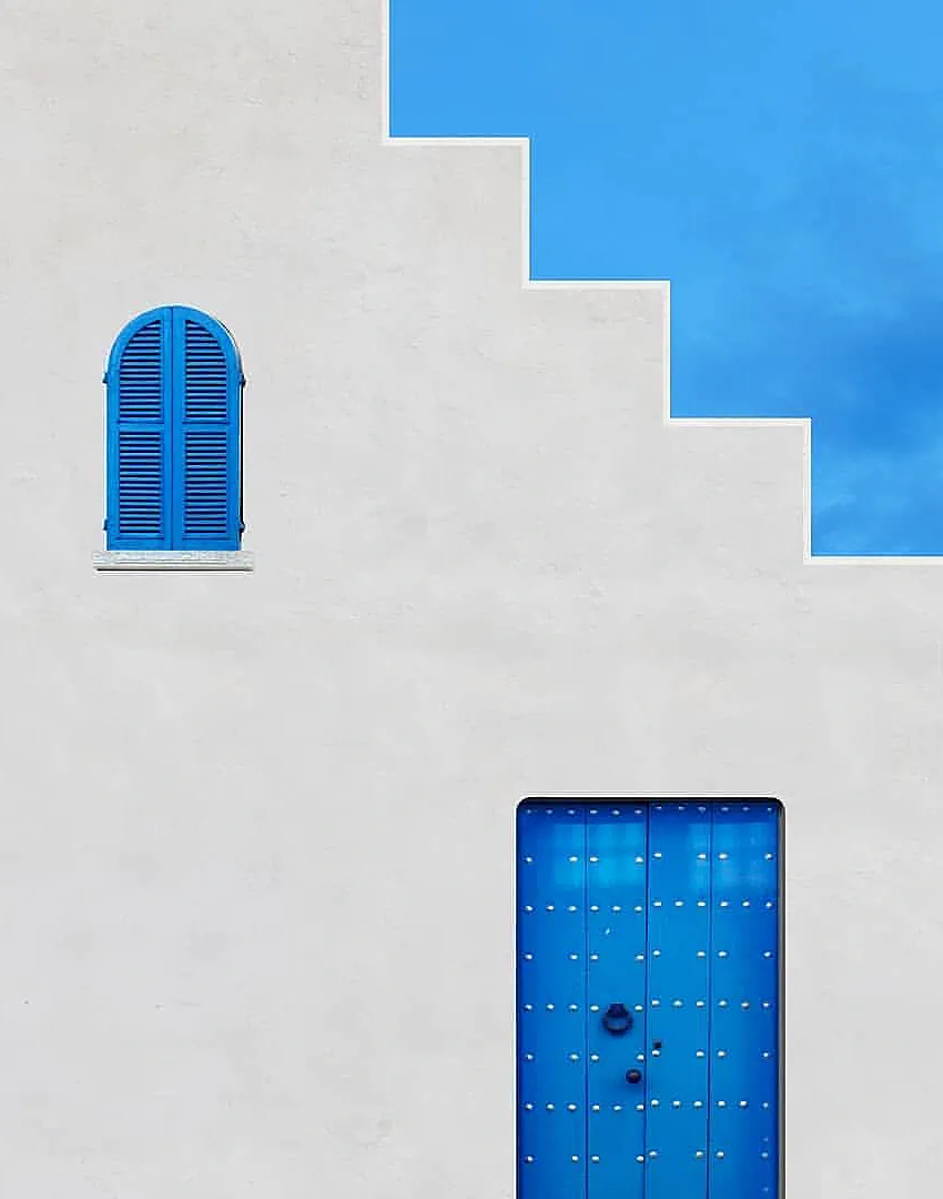
White space (also referred to as negative or empty space) is always a key consideration in website design, particularly when creating asymmetric layouts. Text, media, artwork, and structural elements should be given space to breathe. Few things are worse than complex or unorthodox designs that are cramped and struggling for air. White space can also be thought of as a design element, deserving as much attention as "tangible" elements such as text and shapes.
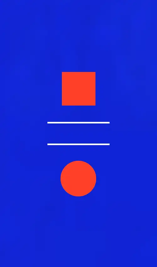
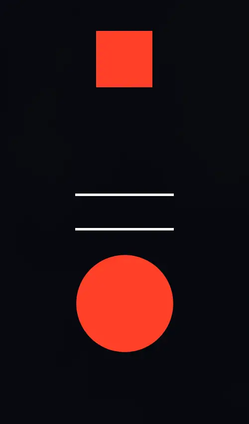
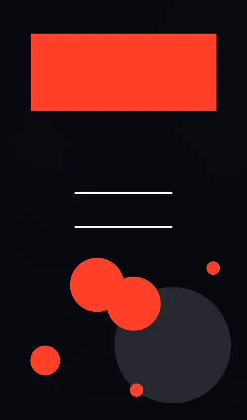
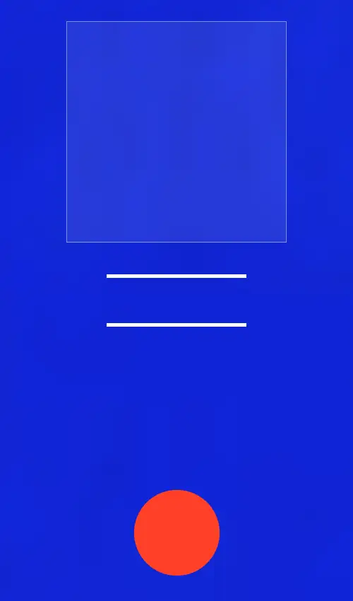
Asymmetric balance describes the harmony that exists when design elements cohere to form a unified, visually appealing whole. This means no design element or elements should dominate others to the extent that they're dwarfed or redundant, or appear to have been added as afterthoughts. As far as website design is concerned, the foundations of asymmetric balance can be developed by experimenting with techniques such as:
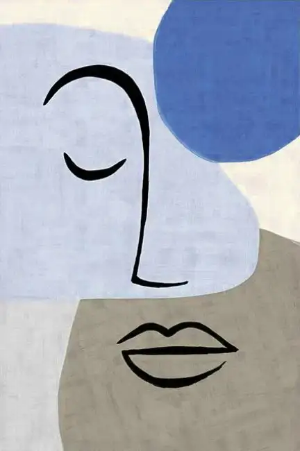
The layouts below articulate the concept of asymmetric balance through combinations of form, weight, and distance.
In its most obvious form, typographical variation might consist of pairing a serif header with sans-serif body text. But there's much more to typography than selecting a typeface, and with asymmetric websites it pays to explore the unexplored and be as bold as design constraints allow. As a very general rule, I've found that contrasting font weights and text justification (whether in headers or website body text) can be a quick, simple, and effective way to create asymmetry and add a bit of extra impact.
To achieve typographical variation, designers have access to CSS style properties that control:
Font Color
Font Size
Line Height
Word & Letter Spacing
Font Weight
Text Decoration
Text Stroke
Normal vs. Italic Text
Upper / Lowercase
Justification
Text Wrapping Options
Writing Mode
Movement often features in asymmetric web design, print media, and paintings. In the context of web design, the term refers to the illusion of flow and dynamism that guides the user's eye towards calls to action, enroll or subscribe buttons, and discounts or special offers.
The illusion can be created by positioning design elements in a specific way, using shapes (such as diagonal lines or extended arrows) to draw attention from one element to another, or by using color and/or emphasis.
With asymmetric web designs, best practices focus on balance, hierarchy, and intentional but controlled disruption. As with their symmetric counterparts, usability remains paramount and in most cases the layout should be able to adapt seamlessly to different screen sizes.
Many web designers endorse the use of grids for asymmetric designs, but I'm not convinced they're necessary or even a good idea. Sure, structure is important, as is a degree of consistency and adherence to the site's design language, but grids by their very nature are constraining and pretty much the opposite of what asymmetry strives for.
When grids are used, it's worth trying to intentionally break them. One way to do this is by offsetting images so they overlap each other or shift vertically into separate sections above and below. It's an easy effect to achieve and one that can help a lot to add extra depth and personality.
Split screens, with contrasting content on each side, are used fairly often in asymmetric web layouts, and in certain applications can do a lot to conjure interest and intrigue. They're generally deployed as hero images or full page banners, but can be used just as effectively elsewhere, too.
Layering refers to elements such as floating buttons and techniques such as staggered cards and overlapping shapes. As well as breaking up the symmetry, layering can be used to build a sense of motion and hierarchy. The best, commonly-seen example I can think of would be a trio of cards detailing the price tiers and benefits of a product or service, where the middle card is slightly raised and bigger than the others. Subtle color variation is commonly used to make the larger card stand out.
Animations aren't specific to any particular style of design, but are sometimes used in asymmetric layouts to emphasize unevenness. Typically, the key components of the design (images or blocks of text, for example) will slide into view from the left and/or right of the screen, thereby spotlighting the layout's composition and absence of horizontal or vertical symmetry.
The obvious drawback is that while some users like animations, many don't. Some users find them distinctly irritating. I'm quite neutral about them most of the time, but I've seen horrible examples of overkill that were really distracting.
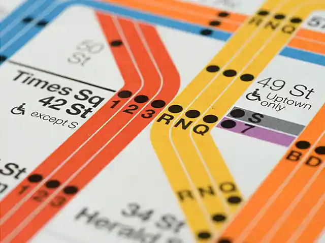
Helvetica is the go-to typeface on the New York subway, but it wasn't until 1980 that it began replacing a German rival introduced over a decade earlier.

The Firefox text reflow extension is the most useful mobile browser add-on I'm aware of. Find out what it is and how it can improve the way you browse the internet.