 AB Design
AB Design
AB Design
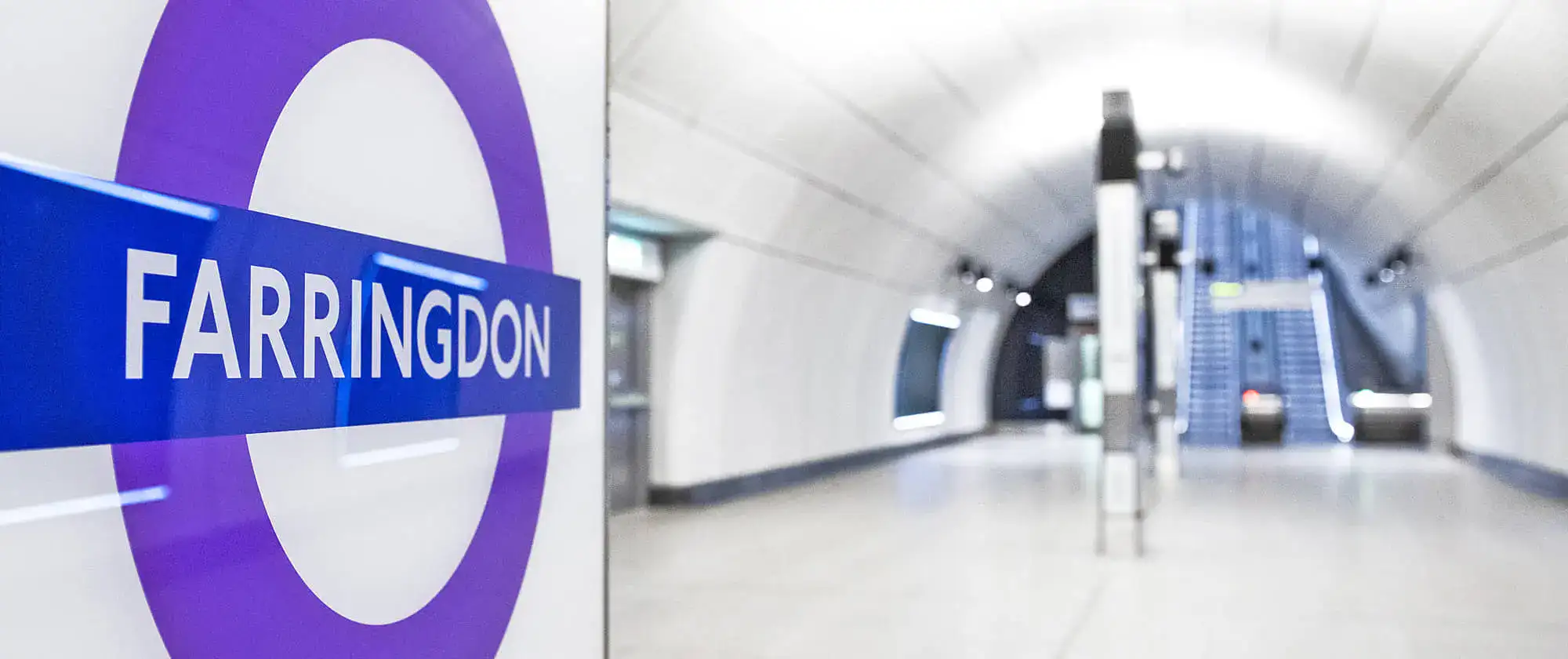
In 1916 English craftsman and calligrapher Edward Johnston designed Johnston Sans, a typeface that's been used for signage on the London Underground for over a century. Johnston's creation is considered one of the world's longest-surviving examples of a corporate typeface.
The typeface was commissioned in 1913 by the head of London Electric Railway (LER), the company operating the capital's subway system. The brief given to Johnston was simple: LER wanted a typeface that captured "the bold simplicity of the authentic lettering of the finest periods and yet belonging unmistakably to the 20th century".
Johnston promptly turned his attention to Roman letterforms and took inspiration from the square capitals carved into Trajan's Column in Rome. By simplifying and modernizing these ancient letters, while preserving their classic proportions, Johnston designed an iconic typeface that soon became part of London's visual language.
The typeface retained its original form until 1979 when Japanese designer Eiichi Kono updated it. Kono's adjustments were small but necessary: the font needed adapting for phototypesetting systems and the x-height was increased to improve clarity at small sizes. Italic and condensed versions were introduced, too. The typeface was expanded a few years later to include support for different languages.
The problem before us is fairly simple – to make good letters and to arrange them well.
Edward Johnston
The most recent changes were commissioned in 2016. Jon Hunter, Head of Design at Transport for London, wanted a digital typeface that would preserve "the DNA of its truly iconic predecessor" and render perfectly on all present and future branding platforms. Characters such as # and @ were added; some letters were widened; and two new weights, hairline and thin, were introduced.
The revisions were made by US firm Monotype after studying Edward Johnston's original sketches and examining archive resources. The new typeface, Johnston 100, was unveiled in June 2016 and deployed the following month.
An innovator and a fine craftsman, Edward Johnston was a modest man who created his typeface while living in Ditchling, a village in the southeast of England and home to a community of fellow artists. When asked to list his achievements for Who's Who he duly noted: "Designed block letters based on classical Roman capital proportions (for London Electric Railways), 1916".
Another gifted typographer whose work profoundly influenced Britain's visual identity in the 20th century was Eric Gill, a friend and former student of Edward Johnston's. Gill first met Johnston in 1905 at London's Central School of Art and Design (now known as St Martin's College) while Johnston was teaching calligraphy.
Two years later Gill moved to Ditchling and in 1914 was commissioned to carve the Stations of the Cross at Westminster Cathedral. Despite initial controversy (some critics derided his panels at the Cathedral as emotionally cold and lacking religious fervor), the commissions continued and Gill's reputation as a sculptor grew.
In the 1920s Gill began experimenting with improvements to Johnston's London Underground font. It was these experiments that led to the creation of Gill Sans, released by Monotype in 1928.
Gill Sans was an instant success and, like Johnston's typeface that inspired it and which it closely resembled, was adopted for use on posters, timetables and signage by British railway companies. An article about London North Eastern Railway (LNER) and its decision to use Gill Sans as a standard typeface was published in the Monotype Recorder, Winter 1933.
The article noted that "Mr Gill, like Mr Johnston before him, manipulated the letters in order that they should seem to be monotone in weight whilst remaining true Roman in form [...] the monumental effect of the Gill Sans capitals, with the famous capital R, is peculiarly attractive."
The LNER introduced its new typeface incrementally: tickets were standardized first, followed by timetables, menus, stationery and posters. Eric Gill played a part by re-painting the name plate on the Flying Scotsman, the world's fastest steam locomotive. As a reward for his efforts, he was given a non-stop trip on the train from London to Edinburgh.
The recognition Eric Gill earned from his new typeface easily eclipsed any attention his friend Edward Johnston received. Gill's work was used extensively in Britain, while the Johnston typeface on which it was modelled was reserved for the London Underground. Driven perhaps by pangs of guilt, Gill wrote to Johnston:
I hope you realize that I take every opportunity of proclaiming the fact that what the Monotype people call Gill Sans owes all its goodness to your Underground letter. It is not altogether my fault that the exaggerated publicity value of my name makes the advertising world keen to call it ... Gill.
Eric Gill
An expert on typefaces summed up these two designers quite amusingly a few years ago. He observed that while Eric Gill was flamboyant, controversial, and one of the most influential British artists of the 20th century, Edward Johnston was much more of an underground figure.
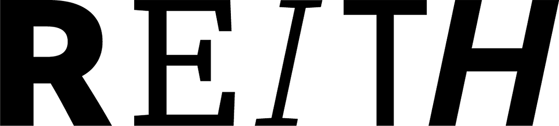
In the early 20th century London's underground railway introduced its own, customized typeface; in August 2017 the BBC announced its intention to follow suit. The new typeface is named BBC Reith (after the corporation's founder, John Reith) and intended to create a uniform voice across the BBC's various platforms, increase clarity at small sizes, and offset the cost of licensing commercial typefaces.
Until this announcement the corporation had been using Arial and Helvetica for digital services and Gill Sans for printed matter. But while Gill Sans will continue to be used for the logo, BBC Reith will take on the role of presenting visual communication. The typeface evolved from a collaboration between the BBC and Dalton Maag, a firm of international typeface designers headquartered in London, and took over a year to develop.
The new fonts consist of serifs and sans serifs, available in a variety of weights, some of which pay homage to Gill Sans.
As well as offering greater flexibility and improved clarity at small sizes, the BBC is hoping the new typeface will generate significant savings in licensing fees. Previously the corporation had to pay for licenses to use Arial, Helvetica and Gill Sans.
According to one source: "Generally, costs of licensing depend on how many unique website hits you get a month. Depending on the number of hits, the costs for the BBC could be enormous. An organisation could pay a one-off fee for longer periods, but that's going to be a massive fee."
The BBC hasn't given a breakdown of costs associated with licensing typefaces, but claimed that substantial savings would result from its new, in-house style.
Typography is an important part of the website design process. It has a huge impact on look and feel, as well as shaping usability and the effectiveness of visual calls to action. Traditionally web designers were restricted in terms of which typefaces they could add to websites and until quite recently most sites relied on system fonts such as Arial, Verdana or Georgia.
Those days are now gone: open source fonts can easily be converted for web use and it only takes a few minutes to install any of the dozens of typefaces freely available from Google Fonts.
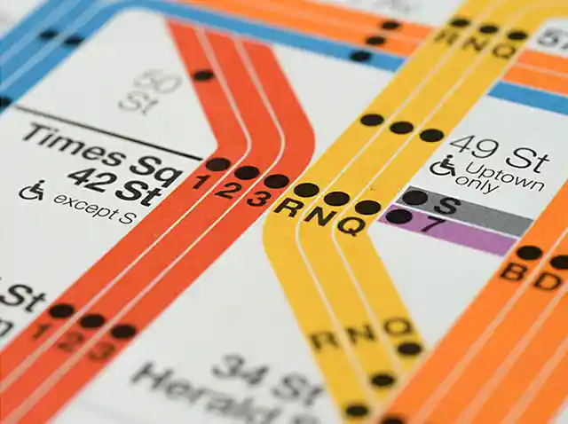
Helvetica is the go-to typeface on the New York subway, but it wasn't until 1980 that it began replacing a German rival introduced over a decade earlier.

Due to privacy concerns and increasing user awareness, not everyone wants to use a Google or Microsoft keyboard. This article compares three popular Android alternatives.