 AB Design
AB Design
AB Design
Pictograms have been a feature of the Olympics ever since their debut at the Tokyo games in 1964. Their evolution from that first appearance to the animated designs unveiled at Tokyo in 2020 has been a long, colorful journey, and one that's well worth exploring.
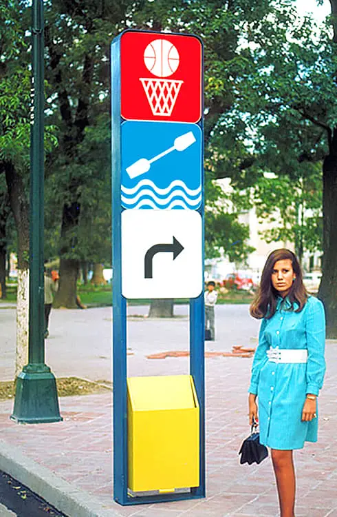
The 1968 Olympic Games in Mexico City were notable for several reasons, one of which was graphic design. Pictograms designed by Lance Wyman (shown above) were deployed city-wide to create a highly-acclaimed wayfinding system that transcended language barriers and could be understood by anyone.
As well as featuring on tickets, posters, and at stadium entrances, pictograms were integrated into roadside totems and information booths, and added to buses, bus stops and transport signs. Lance Wyman's creative oeuvre in Mexico City was praised by the Washington Post for its functionality and outstanding visual design.
His graphic design for the 1968 Mexico City Olympics identity is widely considered a pinnacle of environmental and branding design, and his pictographs, a universal, visual language, set the standard for signage at international events.
The Washington Post
Despite being brought to a temporary halt after Palestinian terrorists invaded the Olympic Village and murdered 11 Israeli athletes, the 1972 Munich Games did have a few highlights. Mark Spitz set a world record by taking 7 gold medals for swimming, and Olga Korbut – in her first Olympic appearance – almost single-handedly redefined the sport with a trio of near-perfect performances.
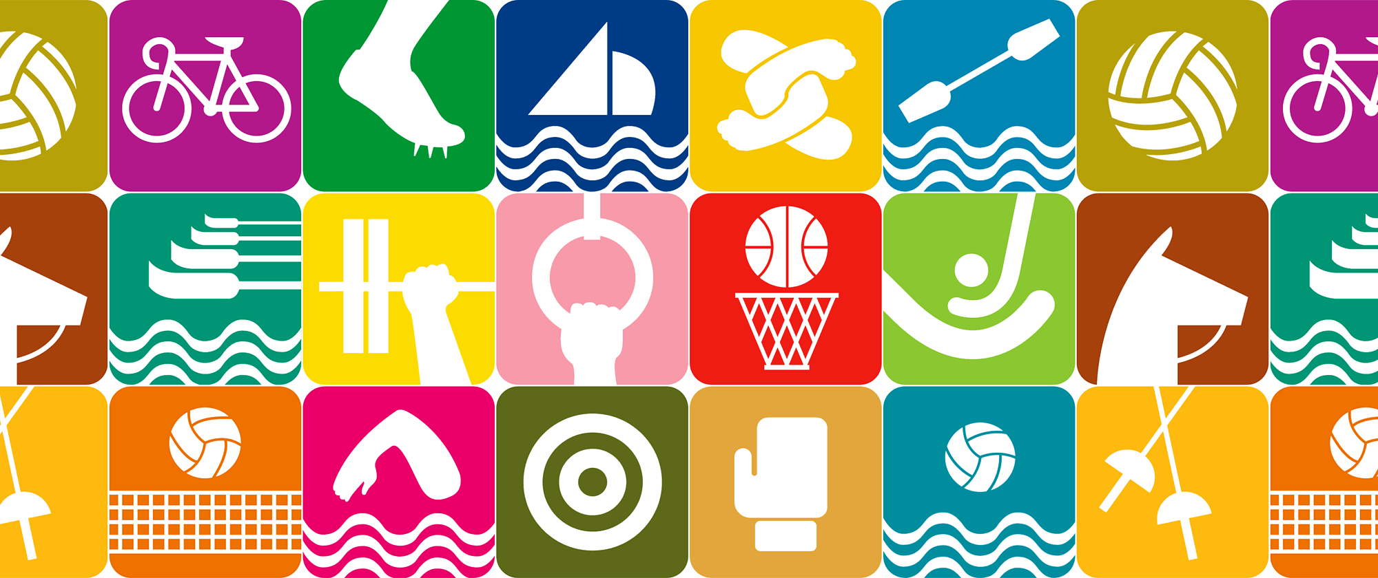
Another highlight was Gerhard Joksch's pictograms. Using a grid with criss-crossing diagonals, Joksch blended thin lines of sports equipment with prominent heads and abstract body parts to create a collection of visually striking symbols that had a profound impact on the design industry.

In September 2022 the International Olympics Committee issued its first ever brand identity system, a 129-page manual packed full of graphics, illustrations, custom-designed typefaces, photographs, and what the IOC describes as a "universal Olympic pictogram system".
As colorful as the manual is, and as nice as the graphics and illustrations are, there's no denying that these "universal pictograms" are virtual clones of Gerhard Joksch's designs for the Munich Olympics. You really have to look carefully at each design to spot the differences.
But there are some new additions. Golf, for example, was added as an Olympic sport in 2016, so while IOC's pictogram is clearly inspired by Joksch's work, it can at least be considered original.

The 1994 Winter Olympics were held at Lillehammer, a small town in southern Norway with a population of less than 30,000. This was the first time Norway had hosted the event since 1952.
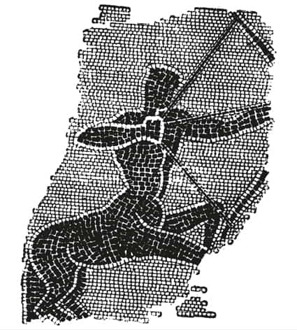
Themes of snow and ice permeated the games' graphic design, but it was the pictograms – inspired by a 4000-year-old rock carving that depicts a human figure skiing – that did most to capture the spirit of Norway's cultural roots. Discovered on the island of Rødøya and considered one of Norway's national treasures, the carving is believed to be the earliest evidence of skiing anywhere in the world.
Markus Osterwalder, Secretary General of the International Society of Olympic Historians, discussed the Lillehammer pictograms and their cultural relevance.
A new and important change took place for the 1994 Games in Lillehammer where the pictograms told a story. For the first time, a country's heritage was incorporated into the graphic design, something which belonged to Norway and was linked to winter sports.
Markus Osterwalder

Before pictograms were introduced to the Olympics in 1964, illustrations were used to represent sporting events. Some illustrations were good, but most are products of their time and not especially interesting. An exception was in 1960 when designers at the Rome Olympics conjured a set of illustrations that are remarkable for their complexity and evocation of ancient Greece.
Despite their sophistication, or perhaps because of it, they were never used for wayfinding and deployed only as small decorative touches on the front cover of daily programs.

"A viral sensation" is how some commentators described the pictograms for the Tokyo 2020 Olympics. Unlike their predecessors at earlier games, the Tokyo pictograms were "kinetic". They moved.
Drawing from an extensive library of video and photographic resources, Chief Designer Hiromura Masaaki spent almost 2 years creating these animated works of art, carefully ensuring each design captured the essence and vitality of the sporting event it depicted.
They were used at competition venues and on digital signage, and shown off on social media channels and the official website. While some observers felt the design of Tokyo's 2020 games was bland and lacked personality, everyone agreed the kinetic pictograms were one of the highlights.

Coming soon, Paris 2024. It'll be interesting to see what French designers come up with. It's hard to imagine they'll spurn the chance to outdo the 2020 pictograms, but it's just as hard to see how Tokyo's kinetic designs can be bettered.
